Cécile Rosenstrauch outlines the new Fall Winter 23/24 Color Intelligence trend book
InterviewsThe Fall Winter 23/24 Color Intelligence trendbook has just come out. What’s the season’s watchword and why?
The key word for the new fall winter 23/24 season is “projection.” This word contains the idea of taking action while staying grounded, but also while keeping our heads in the clouds and aiming for the stars.
This season’s guiding principle includes purposeful action and projects imbued with convictions as well as the idea of making ambitious plans and of dreams and idealization.
Our four themes are powered by a positive and even vital momentum: a need for bold actions and for looking and planning ahead. We need to blast off into distant worlds. It’s happening here and now, but also in other places and in outer space.
How is projection expressed with reference to brand values or consumption drivers?
Projection is represented in the Twist theme through ideas about exploring the unlimited possibilities of shape and the mix of Art Nouveau and artisanship. There’s a strong relationship between tradition (taking inspiration from the Art Nouveau period) and emotion. For Twist, projection comes from being inspired by the era and the effervescence of the 1920s with its Art Nouveau references, while still maintaining a focus on modernity. Gaudi, for example, was a slightly insane visionary who created architecture by moving beyond standard practices, and his work was very innovative! Twist is the idea of a projection into modernity.
Projection appears in the Planet B theme as the desire to head out to faraway worlds that are both familiar and unknown at the same time. This key concept manifests in a very eloquent way through imagery and flamboyance. Planet B is expressive, fascinating and finely tuned; it’s between communication and emotion. It’s the theme of the imagination. We’re projecting to another planet, we’re trying to get away.
The Free Mind theme is based on and develops the desire to use an inventive, free-wheeling vision to rethink how we create and produce. This is why we’re in the projection mode: we’re immersed in freedom, creativity and ingenuity. This theme is very socially engaged, it’s a new way of thinking for the new generations, and it concerns all arenas (economic, social, political …). It represents a desire to rework and revise, using what exists and with total carte blanche.
And finally, Virtuoso embodies Projection by linking technology with sensuality and putting it at the service of creativity. This theme reconnects with a concept of extreme luxury that’s creative and inventive. With Virtuoso we project luxury into the modern world. We become virtuosos in savoir-faire, and, thanks to technology, we’re also virtuosos in top-quality design and manufacturing. Tradition gets an update through the lens of innovation, placing this theme between tradition and reason, two drivers of consumption.


What are the most compelling scenarios in the new trendbook?
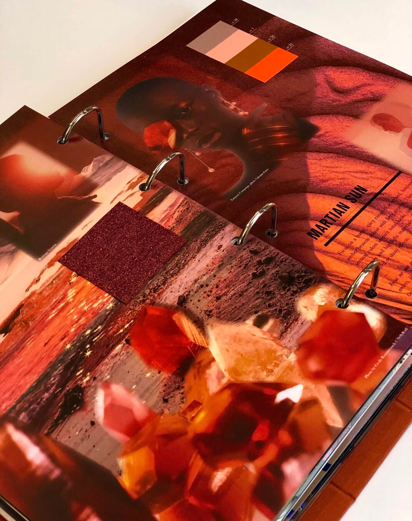
I adore the Martian Sun scenarios (pgs. 106-107). They’re a new way to talk about flamboyant oranges and reds. I really like this approach to a burning, spicy range, which, in fact, is inspired by the Dune film by David Lynch. I like these warm, sensual tones and the idea of colors that blaze combined with more optimistic storytelling. It’s radical and immersive, and it reassures and comforts.
I also really enjoy the Manifesto Clash range (pgs. 38-39) for its free-spirited attitude representing the Memphis movement in the 1980s. It was fairly revolutionary to move from utilitarian, functional design to a not-so-serious, joyful esthetic. With Manifesto Clash, we’re not striving for functional – even though we’re talking about furniture – but for a search for extreme freedom and for powerful design with a message. I appreciate these vivid, joyful colors and the unconstrained, liberating way of thinking.
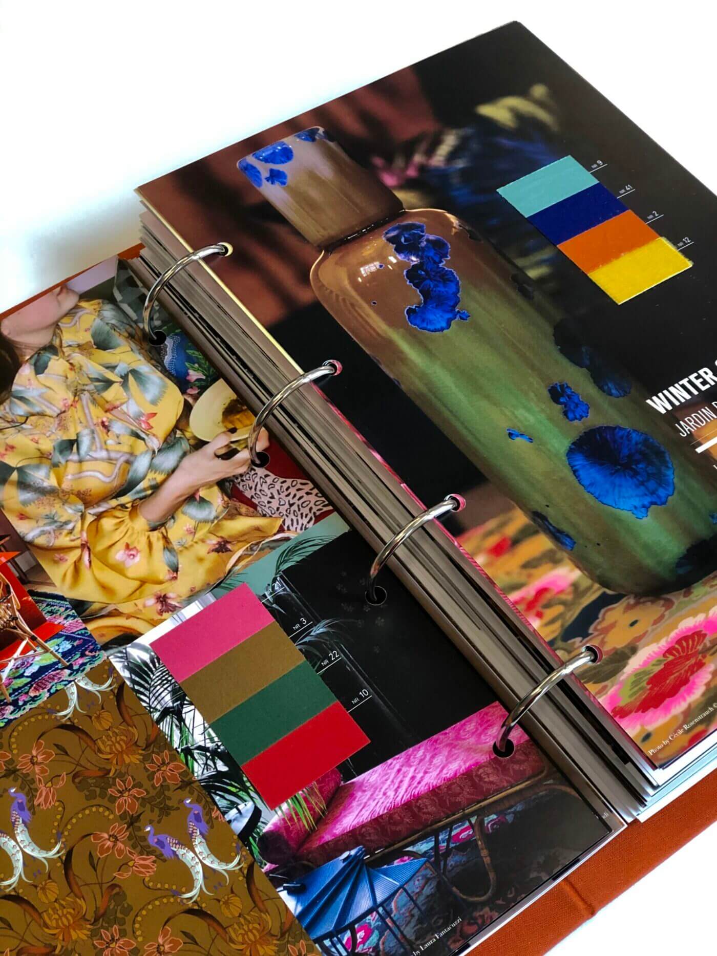
The Winter Garden scenario (pgs. 16-17) is also one of my favorites. I really like the idea of having a garden in winter, of bringing life and ornamentation into our environments and our wardrobes and of living in a decorative environment that’s very lush and sensorial. With the orchards and birds inside the home … there’s poetry in these pages that truly touches me.
Get more information on our new FW 23/24 Color Intelligence trendbook!


